DMA map
The map displays a region's District Metered Areas (DMAs) as color-coded geographical areas. The shape of each DMA area is based on the locations of the DMA's sensors. To view the map, select Map view (![]() ) on the Region page.
) on the Region page.
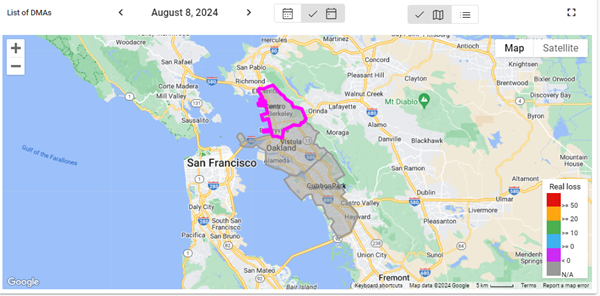
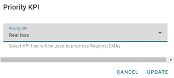
To change the priority KPI represented on the map, click the legend header and select an option from the Priority KPI dropdown. To view color-coded changes by date selection, select Real loss or Apparent loss and then click Update. Use the date picker above the map to view changes over time.
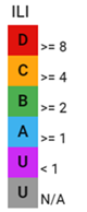
The color of each region on the map is based on the performance of the DMA:
-
Red (D). The performance is bad. The utility is using resources inefficiently and non-revenue water reduction programs are imperative.
-
Yellow (C). The performance is poor. Non-revenue water reduction efforts should be intensified, even if water is plentiful and inexpensive.
-
Green (B). The performance has potential for improvement. Consider pressure management, better active leakage control, and better maintenance.
-
Blue (A). The performance is good. Further loss reduction may be uneconomic and careful analysis is needed to identify cost-effective improvements.
-
Purple (U). The value is less than zero.
-
Gray (U). Represents a region with no active DMAs.
With a DMA region selected on the map, click the arrow in the pop-up window to navigate to the corresponding DMA sensors page.
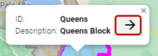
Note: For more information, see DMA sensors.
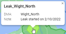
Hover over a leak pressure area (in light green) to reveal an information window with the leak name, associated DMA, and any notes.
As part of the Water Leak Management service, the Itron Delivery team will identify and add leak areas to the map, along with any relevant notes, so that a historical search will show the evolution of the leak from identification to resolution or closure.
|
Tip: The standard Google Maps controls enable you to refine your view of the map:
|