DMA model map
The Model Visualization DMA map displays the DMA's total area, sensors, nodes, links between nodes, and pressure and flow simulation data.
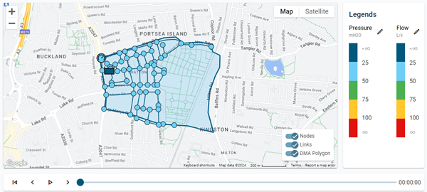
The map's legend contains toggle switches to customize the map view.
-
Nodes. The map displays the nodes in the model.
-
Links. The map displays the links between nodes.
-
DMA Polygon. The map displays the boundary of the DMA.
Note: Click a toggle switch to enable or disable that option. By default, all options are enabled.
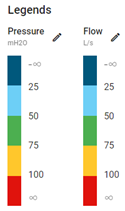
The color of each component on the map indicates simulated pressure or flow metrics. Refer to the Pressure and Flow legends next to the map for color coding.
|
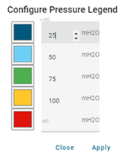
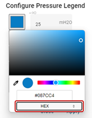
Tip: To adjust the color-coded thresholds for pressure or flow, click the corresponding edit icon (
To change the color of a category, click the corresponding color box and then select the desired color with the color picker. You can also click the selector at the bottom of the dialog to select a color format (RGB, HSL, or HEX). You can then edit the values in the field(s) above the selector.
After making your changes, click Apply. |
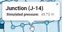
Click a node or sensor on the map to reveal a pop-up window with simulated pressure or flow information and to populate the chart beneath the map. For more information, see DMA selector table.
Use the standard playback controls beneath the map to see simulated pressure or flow changes over time. Click the play icon (![]() ) to view hourly changes. Click the left arrow (<) or right arrow (>) to quickly move between hourly timestamps.
) to view hourly changes. Click the left arrow (<) or right arrow (>) to quickly move between hourly timestamps.

|
Tip: The standard Google Maps controls enable you to refine your view of the map:
|